Blog
Insights
First Impressions Online: Why Your Homepage Has 3 Seconds to Work
Ben Powell
Head of Marketing
Jun 6, 2025
First Impressions Online: Your Homepage Has 3 Seconds to Win or Lose a Visitor
You’ve paid for the click—or earned it organically. Now you have about three seconds before your new visitor decides whether to stay or bounce, likely for good. Eye‑tracking studies show users form an opinion in as little as 50 milliseconds, then use the next couple of seconds to act on that instinct.
Pass the three‑second test and you earn attention. Miss, and your bounce rate devours your pipeline. Here’s how to nail that split‑second first impression.
Lead With Clarity, Not Cleverness
Your headline has a single job: explain what you do and why it matters—fast.
Skip:
“Reimagining the way teams connect to their potential.”
Use:
“AI‑powered website personalization that lifts demo conversions by 35 %.”
✔️ Clear ✔️ Specific ✔️ Immediately valuable
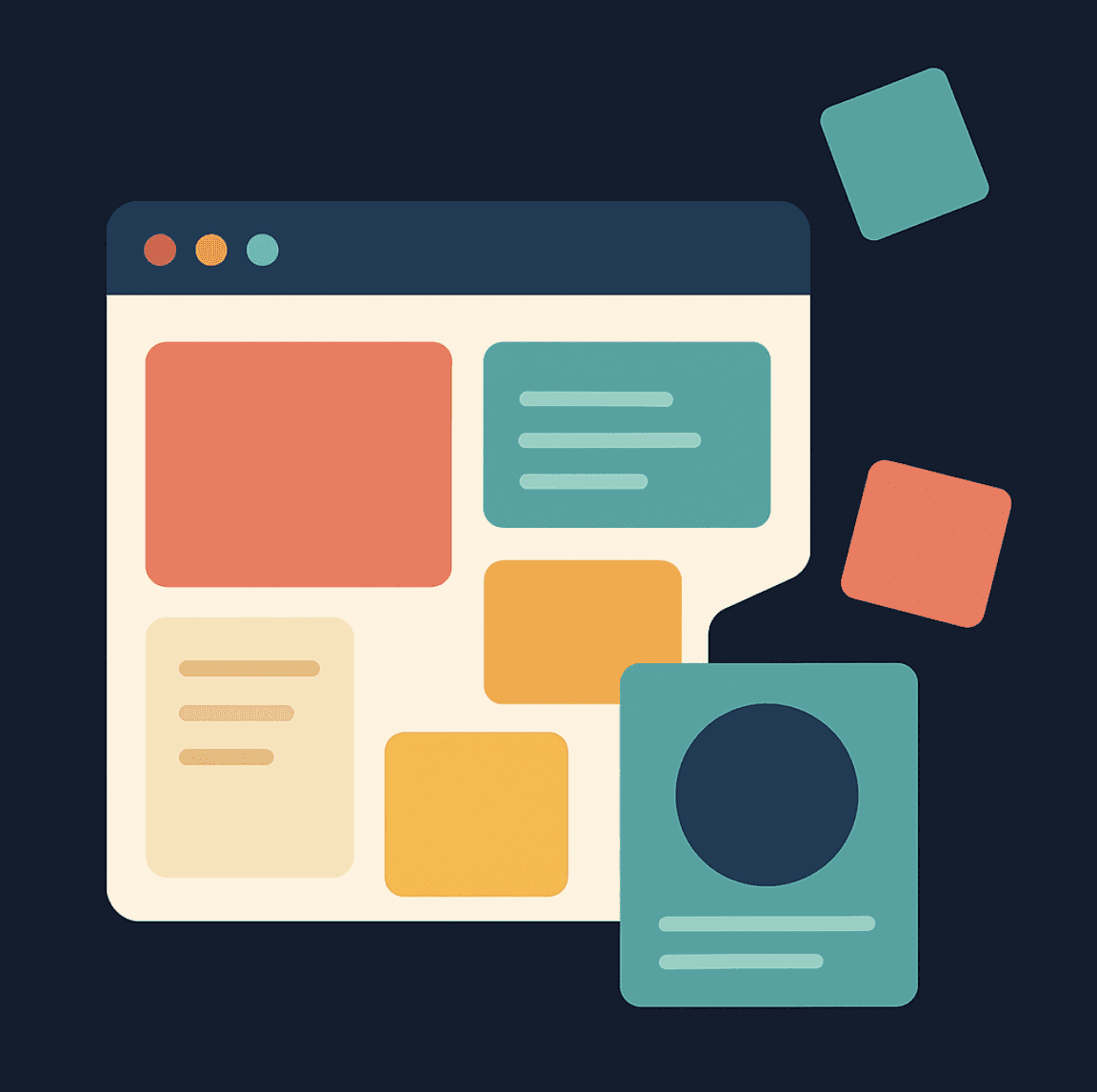
Design a Visual Hierarchy That Guides the Eye
A great layout reads like a story:
Headline: What you do
Subhead: How it helps
CTA: What to do next
Use generous whitespace, one standout CTA, and minimal clutter—visitors scan, they don’t read.
Pro tip: Open your homepage and squint. Whatever you notice first is your actual hierarchy.
Proof Beats Promises Every Time
Humans trust other humans, not unchecked claims. Within those first seconds, show:
Recognizable client logos
Hard numbers (“Used by 1,000+ SaaS teams”)
Bite‑size testimonials (“Cut our bounce rate 22 % in a week”)
Place proof near your primary CTA to reinforce the decision.
Make Visitors Feel It’s Built for Them
Users don’t ask “What is this?”—they ask “Is this for me?” Personalization answers yes.
Swap copy for different industries
Differentiate return visitors from first‑timers
Tailor messaging for ad clicks vs. organic traffic
Tools like Unusual can rewrite headlines, proof points, and CTAs in real time so each visitor sees a version that feels handcrafted.
Mobile Performance Is Non‑Negotiable
Over half your traffic is likely on a phone. If your page is slow, jumpy, or unreadable, you lose before content even loads.
Compress images and defer non‑critical scripts
Use responsive, touch‑friendly layouts
Aim for sub‑2‑second load times on 4G
Fast, smooth, and accessible wins attention—and conversions.
Final Takeaway
Three seconds is all you get because attention is today’s scarcest currency. You’re not just up against competing websites; you’re battling Slack pings, overflowing inboxes, and TikTok’s infinite scroll.
Make the value obvious. Make the path forward clear. Make the experience personal.
Do that, and your homepage will pass the three‑second test—and convert curiosity into pipeline. Fail, and visitors will bounce, often forever.